Do you have difficulty to recognize buttons and notes on WebClass? If you have challanging to recognize or distinguish colors, how do you look at pages on WebClass? We have been trying to make the UI "easy to use for everyone", we think. But we haven't considered the accessibility from another person's view. So, we are going to improve that. This articles sumerize the references about the accessibility guideline and check tools in Japan.
"Public Site Operation Guidelines(みんなの公共サイト運用ガイドライン)" from Ministry of Internal Affairs and Communications
We can learn a lot about accessibility guideline at this page.
http://www.soumu.go.jp/main_sosiki/joho_tsusin/b_free/guideline.html
This is a guidance for the gavernment and public instutusions in Japan to make their websites barrier-free. For specific guidelines, refer to “JIS X 8341-3: 2016”, but the contents are almost the same as WCAG 2.0 (described later). There are survey reports and seminar guidance for national and local public organizations, too.
I was interested in the last one, “Introduction video on how to use web pages for people with disabilities (障害者のウェブページ利用方法の紹介ビデオ)”. Although it is very important to design UI with solid understanding about users, we tend to think all people as same as us. It's hard to imagene how visual or color challenging people use computer. I had never used the accessibility support tool that is installed on modern OSs. Theses videos help us to know that.
Web Content Accessibility Guideline
The website “Web Accessibility Infrastructure Committee” (https://waic.jp) provides the information on “JIS X 8341-3: 2016”. This page is linked from the guidance page on Ministry of Internal Affairs and Communications we read at last section. This committee held a seminar on October 17th.
In addition to JIS X 8341-3: 2016, the translation into Japanese of the original WCAG 2.0 is also posted here.
-Quick reference
-https://waic.jp/docs/WCAG20/quickref/
-Explanation of each quick reference item
-https://waic.jp/docs/UNDERSTANDING-WCAG20/Overview.html
-Examples of implementation and verification methods
-https://waic.jp/docs/WCAG-TECHS/Overview.html#abstract
Looking at the quick reference, there are some aspects to treat accessibility, and each level and detailed explanation are associated. For example, looking at “1.4.3 Contrast (minimum) level AA”, a concrete reference value is also shown: “The visual presentation of text and text images has a contrast ratio of at least 4.5: 1.”
I think that having specific viewpoints and standards is important for implementation and inspection.
Color universal design
Regarding color, the NPO Color Universal Design Organization (https://www2.cudo.jp/wp/) has released the “Color Universal Design Recommended Color Set” (http://www2.cudo.jp/wp/?page_id=1565)
This is a color palette that combines color combinations that are easy to distinguish even to those who are difficult to distinguish colors. The color palette supports three patterns for painting, printing, and screen, and a guidebook for use is also available in PDF.
According to the FAQ of the guidebook, the colors that are difficult to distinguish, or the colors that appear to be the same color, are different by each person who is difficult to identify colors. Therefore, this color palette is not a perfect pattern, but it is a color that is relatively easy to distinguish for as many people as possible.
Regardless of whether or not to use this color palette, I thought that knowing a little about how the color palette was created would be helpful in our future inspections.
Check tool
How can I make sure that I met the WCAG 2.0 sentence:"Visual presentation of text and text images has a contrast ratio of at least 4.5: 1"? Regarding the contrast ratio, You can check that on this web page based on the WCAG 2.0 criteria.
https://lab.syncer.jp/Tool/Color-Contrast-Checker/
Also, The Ministry of Internal Affairs and Communications provides checker tool called "Minna Accessibility Assessment Tool: miChecker".
http://www.soumu.go.jp/main_sosiki/joho_tsusin/b_free/michecker.html
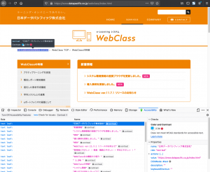
Firefox also has an accessibility check tool in a developer tool panel. Open the developer tools, open the "Accessibility" tab and enable it. I tried to check the contrast on the Datapacific homepage, but NG appeared.
In addition, Chrome has a browser extension that lets you recreate the web page view of people with low vision or color distinguishing hardlyness.
https://chrome.google.com/webstore/detail/chromelens/idikgljglpfilbhaboonnpnnincjhjkd
from now on
Actually, we cannot meet with WCAG2.0 at once. We should picking up the minimum items to be met. Next, I would like to establish know-how for checking and imprementing that. Then, we might be able to keep improving accessibility along with WCAG2.0.